[en] The object Button Group allows the user to define a selection control consisting of multiple buttons. It creates buttons from the list of values defined in the object definition. Each value in the list is rendered on the form as a separate button within the Button Group object.
[en] Once the user clicks a particular button, a variable that is connected to the Button Group gets the value displayed on the button. Knowing which button was clicked, the actions execute accordingly.
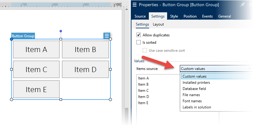 |
[en] Figure 9: Dynamically created buttons display values from various data sources
[en] You can also dynamically generate the list of values. For example, Button Group can get values from a database table, can display a list of files in particular folder or locally installed printers, and much more.
[en] NOTE: The screenshot above shows hard-coded list of values (from “Item A” to “Item E”).
[en] Word wrap support is added for buttons in the Button Group object. When enabled, the button tag that does not fit inside a single line is automatically broken into multiple lines.
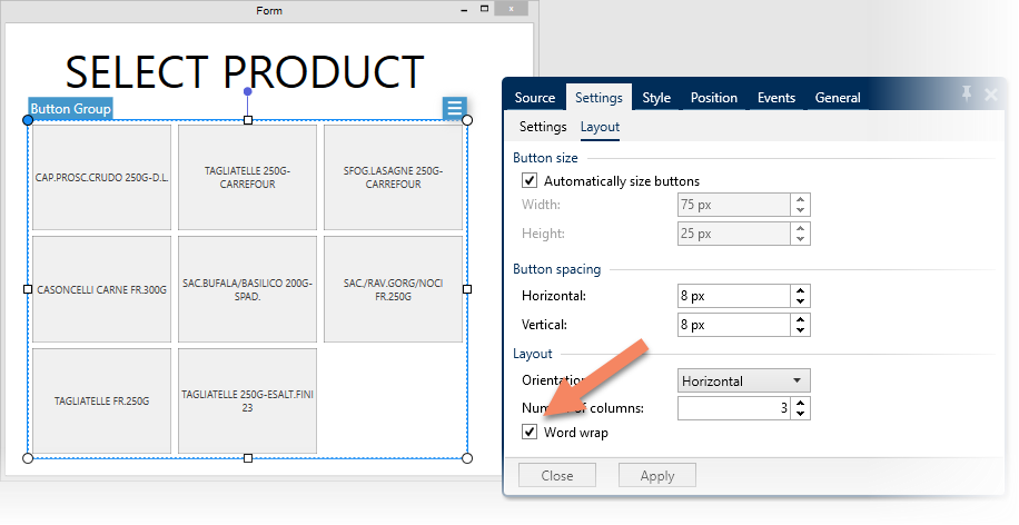 |
[en] Figure 10: Word wrap can be enabled for buttons inside Button Group object
[en] In NiceLabel Designer, you can easily control the visibility of a form object. For example, under some circumstances, the object must be visible and/or enabled and in other cases, it must not be visible, or must be visible, but not enabled.
[en] Each object has a property “Visible” that determines whether the object is displayed on the form and a property “Enabled” that determines if the user can interact with object and use it.
[en] Previously, the visibility was triggered by a variable being EQUAL (=) to some control value in the condition. Now, the variable can also be NOT EQUAL (≠) to the control value.
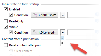 |
[en] Figure 11: You can control object’s state for “enabled” and “visible” with EQUAL and NOT EQUAL relations
[en] NOTE: Product editions NiceLabel PowerForms or above are required for this feature.
[en] The following actions are now available in NiceLabel Designer for building PowerForms applications.
-
[en] Preview Label. This action creates a label preview as a graphic image (e.g. PNG, JPG) on the disk.
-
[en] Get Label Information. This action generates an XML file with information about variables defined in the label file, label dimensions, and the printer configured for the label.
[en] These actions are available in "Other" group in Action Editor.
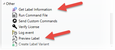 |
[en] Figure 12: New actions available for PowerForms Applications
[en] You would use the Message action to display custom messages and let the user know about certain event that happened in the application, or to provide feedback.
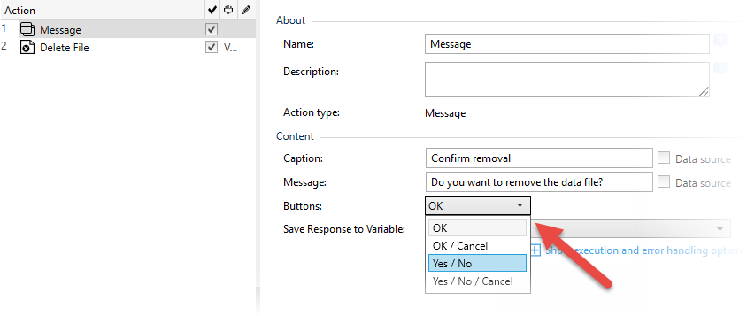 |
[en] Figure 13: The solution is capturing user response
[en] In NiceLabel 2017.3, the Message action can also collect user response. You can configure the action to display a set of common buttons (e.g. OK/Cancel, Yes/No and others) in the dialog box.
[en] When a user clicks on any of the available buttons, Message action saves the response. You can use this information to run appropriate action(s) in the workflow.
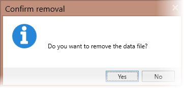 |
[en] Figure 14: Various actions are run based on user response
[en] “Browse File/Folder” action selects a file or folder to be used in further actions down the workflow. The action offers a new option named “Allow non-existing file”. This option allows you to use the action in case you want the user to specify destination for a file that will be created by the application.
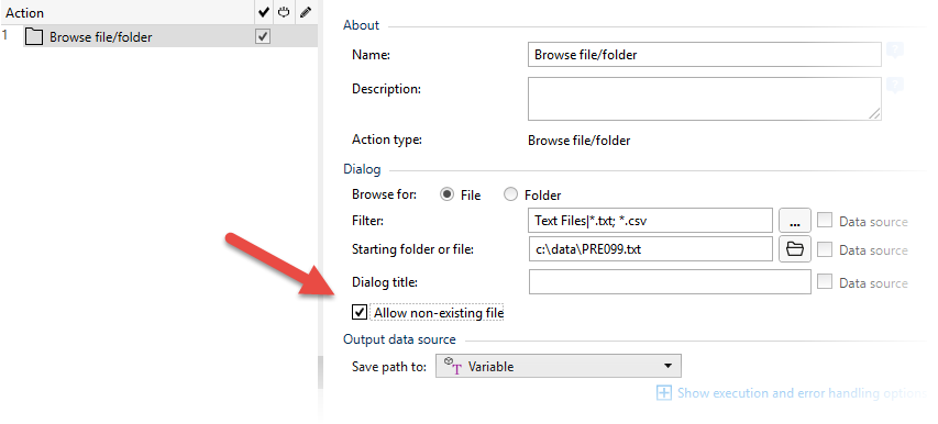 |
[en] Figure 15: Enabling the operator to define the destination file
[en] When you resize a form, there are two possible scenarios.
-
[en] The form object might either resize and/or change its position to remain visible on the resized form.
-
[en] Form objects are no longer visible after the form size is reduced past the point of their visibility.
[en] Starting with this release, another scenario is available.
[en] You can define the minimum size of a form. Once you cross the minimum boundary in the horizontal and / or vertical direction, the form resizing stops, and scroll bars become available. To display a particular part of the form content, you can drag the scroll bars to adjust the viewing area.
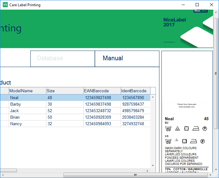 |
[en] Figure 16: The form was designed to run on 1680×1050 screen. It starts to show scrollbars when resized to 1280×800 or below.
[en] The functionality is useful in cases when you design the form for a big screen, but you are also using or testing it on screens with lower resolution. The form is still perfectly usable on a smaller screen. You can scroll the form up / down, and left /right to display any part of it.
[en] By default, the Data Initialization object on the running print form displays all variable data sources from the current label that require input from the user. When you enter the data, the label preview illustrates how the data fits into a label.
[en] In certain cases, such as with highly customized forms, you do not want the user to see all available variable data sources at once. The availability of data sources might depend on multiple factors. It could be the currently logged-in user, data sources storing particular values, etc.
[en] Starting with this release, the form designer has full control over visibility of variable data sources within the Data Initialization object.
[en] The list of available data sources can either be hard-coded using object properties, or provided as a comma-separated list of data source names.
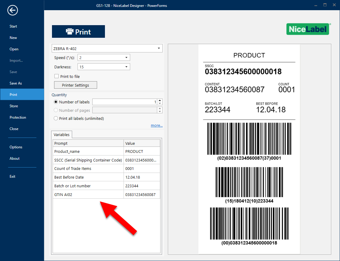 |
[en] Figure 17: The list of variable data sources is configurable.
[en] In right-to-left (RTL) scripts, writing starts from the right of the page and continues to the left. The most widespread RTL writing systems are Arabic, Hebrew and Persian. For such languages, NiceLabel PowerForms applications now supports entering data from right to left.
[en] The following form objects support right-to-left text flow direction:
-
[en] Edit Field
-
[en] Memo Field
-
[en] Text